Raise your hand if you have…
- visited a website where you feel like you’re scrolling forever and ever and ever…
- been able to comfortably browse a website no matter what device you are using
- visited a website with BIG images and almost no content
- been able to use a website like you would an app
- seen websites with lots of colours and shapes and fancy fonts and oh my!
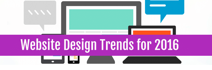
All these and more are some of the trends that are dominating website design going into the new year. So keep scrolling forever and ever and ever… (kidding!) to find out what they’re all about and if they are the right fit for your goals.
Responsive Design
As we’ve mentioned in previous articles, responsive design is the one trend you must follow going into the future. A responsive implementation will make sure your website looks great in any device your visitors use from personal computers to smartphones.
Responsive design is adaptable to any design, even for websites with a more classic look. With a seamless UX (User Experience) and ease of use across different screen resolutions and devices, people are more likely to stay on your site and contact your business and/or make a purchase.
A mobile-friendly website is also more likely to show in search results made on mobile devices such as smartphones and tablets. This is extremely important if you want potential customer to reach you no matter what they’re using to look for a service.
Activity time!
If you’re looking at this article on your desktop computer or laptop, try making your browser screen smaller. See how all the elements in the page move and adapt to the different resolutions? Cool eh!? If you’re on your phone or tablet, this page looks pretty great doesn’t it?
Parallax Design
Parallax is more than just design, it is a technique used in websites to create compelling and interactive online storytelling. If you want to guide your visitors through a specific path and actions within your website, parallax design is great for you.
The key feature of parallax design is the long scrolling where elements and backgrounds move and shift at different speeds as the user scrolls through the page. Some parallax designs also include different effects that gives the website an interactive feel, like being in a video game.
Keep in mind that the parallax experience is not for everyone. If SEO (Search Engine Optimization) is a big part of your website marketing efforts, parallax design may not be your best fit, as it limits you to a single page, and consequently only one set of metadata and URL with no internal linking. It may also pose a challenge when translating the experience to mobile devices, as the actions taken to navigate the website change.
Here are two great examples of parallax design (games included!):
https://ihatetomatoes.net/happy-25th-birthday-game-boy/
Minimalist Design
When it comes to minimalist design, less is more. If you want to put the focus on your content, minimalist design is for you.
Key features of a minimalist design are the use of black-and-white with an accent colour and/or prominent graphic as a focal point. A minimalist website will have no more than 5-6 pages to simplify navigation, and will often replace a classic menu with the popular “hamburger menu” you see in mobile sites.
It is no surprise that minimalist design has been around for a long time and is especially popular with visual artists and “visual professionals” like interior designer and architects. By putting a greater emphasis on your fonts and layout choices to create the flow of your content, it keeps the noise and clutter to a minimum and puts your content front and center.
Minimalist design is great if the objective of your website is to showcase visual-based content rather than text-based content. However, similar to Parallax design this might affect your SEO with less pages, content, and internal linking.
Click here for an example of minimalist design http://www.62models.com/
Flat Design
Flat website design is the colourful cousin of minimalist design. It achieves balance between larger amounts of content while keeping the UI (User Interface) distraction-free.
Flat and minimalist design go hand in hand in many cases, with flat design bringing a wider colour palette. This gives you more flexibility in terms of content, using backgrounds and shapes to draw attention to different elements on the page. A very common element of flat design is the “cards” or “tiles” layout often seen in media and eCommerce sites.
Flat design is a great option for those who want the full benefits of a classic website with all the UX benefits of responsive and minimalist designs.
You may have noticed the big 3 tech giants Google, Apple and Microsoft switching to flat logo and icon designs over the past year. This infographic gives a great visualisation of their design approaches. http://superdevresources.com/design-apple-google-microsoft/
Flat + Parallax Combo #1: https://historyoficons.com/
Application Design
Designing your website as a web application is particularly beneficial for websites with user-generated content.
This approach to design focuses on the actions that users can do on your website, such as creating profiles, managing accounts, making payments, booking appointments and a host of other applications. Application design borrows many elements from flat design when it comes to the UI, where the goal is to create a seamless UX to keep users engaged.
Like parallax design, the full benefits of application design are better appreciated when using a desktop computer, and may involve multiple designs or adaptations when displaying in mobile devices.
For an example of application design, look no further than any online music streaming services like Spotify, Digitally Imported or Google Play Music.