The 00’s were the decade of the internet, and its rise changed the way we view the world forever.
This century so far has been the decade of mobile internet, and the rise of the smartphone and other devices have probably changed the way we view the internet forever.
This means the way the world views your business has changed. And if you haven’t made changes in response, you’re most likely leaving money on the table.
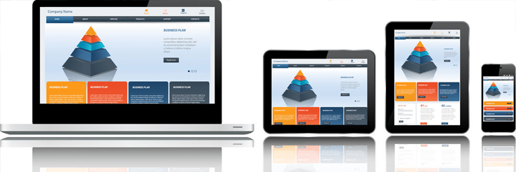
It’s the 21st Century, and your business website needs mobile responsive web design. That means it needs to automatically resize to display nicely on whichever screen it’s being viewed on.
It’s no longer a new technology; it’s no longer something for the future; and it’s no longer an option for your website to not be mobile responsive.
Here’s why.
Google loves responsive web design
Last year, Google introduced a new algorithm that rewards mobile friendly sites in searches made on mobile devices.
This means anyone searching for your product, service, or business on a smartphone or tablet will see results heavily weighted towards mobile friendly sites.
However, responsive web design is about more than your site adjusting to fit the screen.
Google takes a number of factors into account when deciding whether or not your site is mobile-friendly or not.
These include whether the text is readable without zooming, whether the content can be read completely without horizontal scrolling, and whether any links are far enough apart that the correct one can always be easily tapped.
If you want to test this out, do a quick Google search on your own phone or tablet now. You’ll see all the top results are prefixed by the same two words – mobile-friendly.
Your customers love responsive web design
Responsive design is now crucial if you want your website to appear at the top of mobile searches, but it isn’t just Google who’ll think better of you.
With the amount of time we all spend on our smartphones and tablets while riding the bus or subway, in cafés or restaurants, at school or at home, it’s no surprise that internet usage on mobile devices has overtaken that of desktop computers.
Roughly 30 – 40% of website visits now occur on mobile devices. And whether they realize it or not, these visitors are expecting your website to fit their mobile devices. Responsive design is now expected of all websites, and your customers will only think about it when it doesn’t happen. They’ll also wonder why your website is outdated and may decide to take their business elsewhere.
In competitive industries, it’s important to stay ahead of the game. Having a mobile-friendly website can give you the advantage over your competitors in mobile Google searches.
It can also mean that instead of losing customers put off by an outdated site, you could be gaining more customers bouncing in from competitor’s outdated sites.
Updating your website to feature responsive web design means keeping up with those in your industry who already have mobile-friendly websites and ahead of those who have not.